Technology
Highcharts, D3.js, Bootstrap
Data source
Categories
Dashboard, interactive visualization, webapi, geovisualization
Website
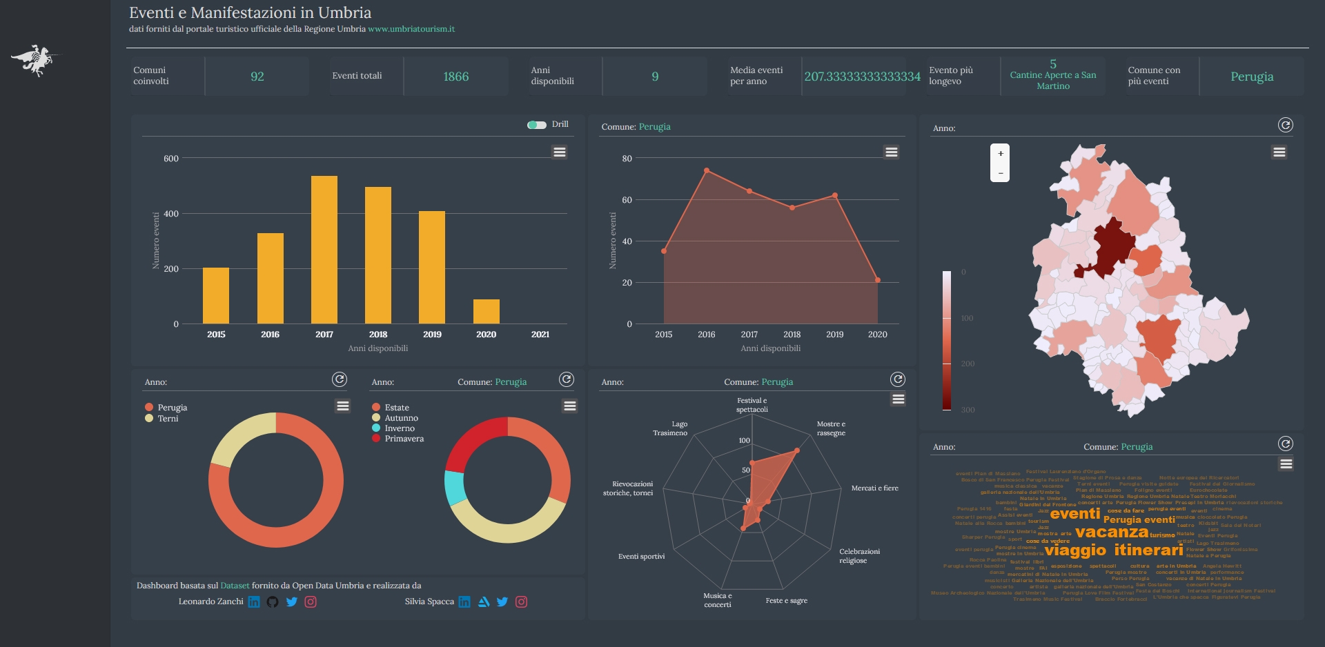
This project is conceived as an interactive Dashboard to explore events and exhibitions in Umbria Region. This Regional Dataset is interesting to visualize due to the presence of several historical re-enactments and musical events, among which the well-known jazz festival “Umbria Jazz”.
Through queries to Region’s Open Data, it’s possible to know what kind of event took place, where and how long it lasts. It’s possible to have a general sight of the information contained in the dataset, a briefly summarize of the data, though a series of panels arranged at the top of the page. Down below it’s organized the main part of the visualization, divided in several charts and a choropleth.
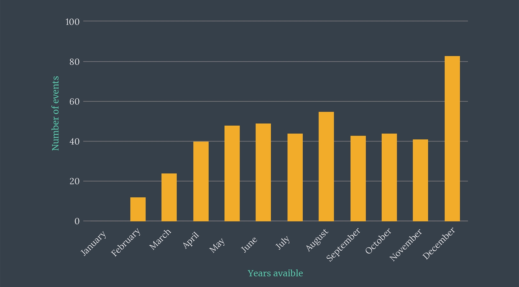
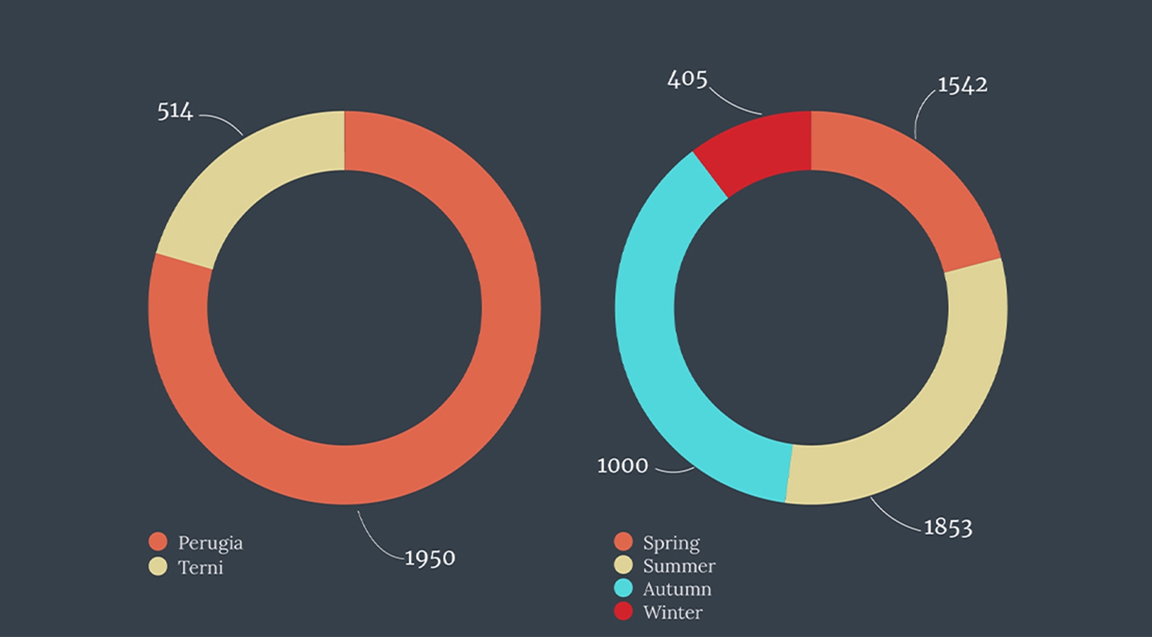
Elements inside the dashboard interact each others to give a whole overview of available data. The user can access to information about distribution of events by different criteria: by years and months available, through a column chart; by district and season, through donuts and by event type through a spider chart. Geovisualization section is represented by a choropleth that shows the amount of events per Region.
Key features: compact, space reuse, interactivty, from general to details..


