Technology
Nivo, Highcharts, Deck.gl, Mapbox, ReactJS, Ant Design, Illustrator
Data source
Categories
Dashboard, interactive visualization, geovisualization, webapp
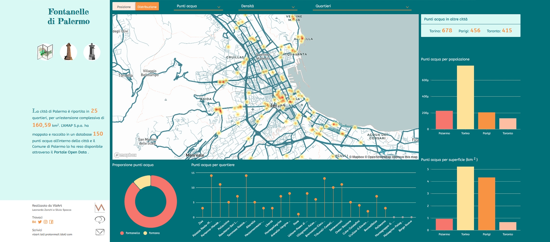
"Fountains of Palermo" comes from the curiosity to visualize a very interesting dataset that we found on the Open Data portal of the Municipality of Palermo: fountains and driking fountains in the city of Palermo.
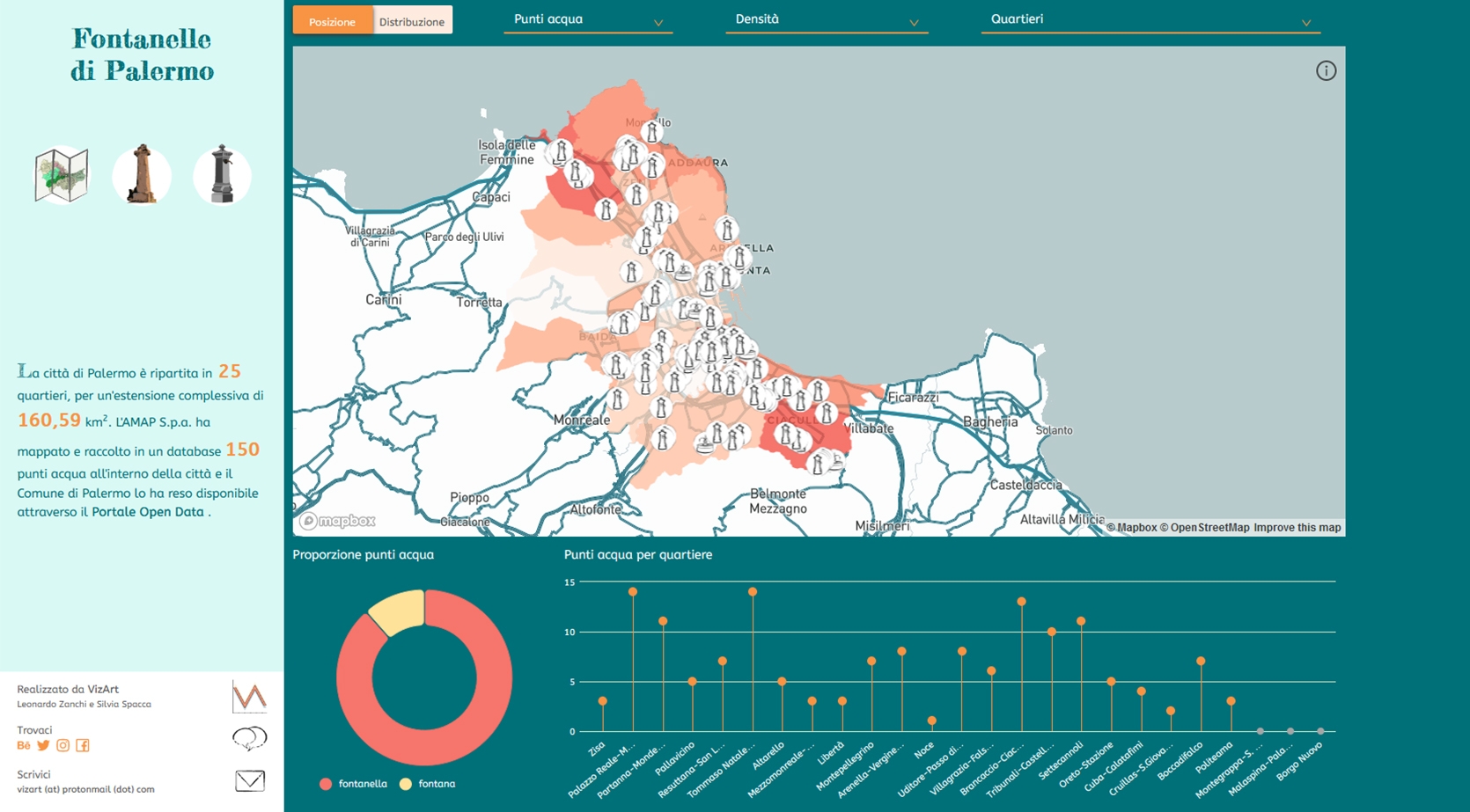
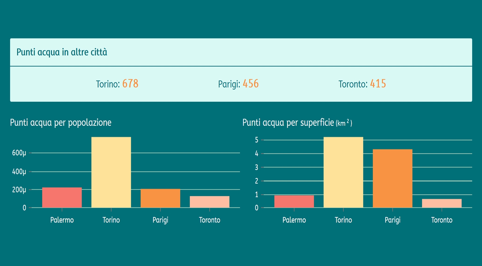
At a first reading, spontaneous questions arose, as: where are the fountains mostly located? In the historical neighbourhoods of the City or in the suburbs? What is the proportion between surface area and fountains, population and fountains compared to other cities of the world? "Fountains of Palermo" try to answer this kind of questions.
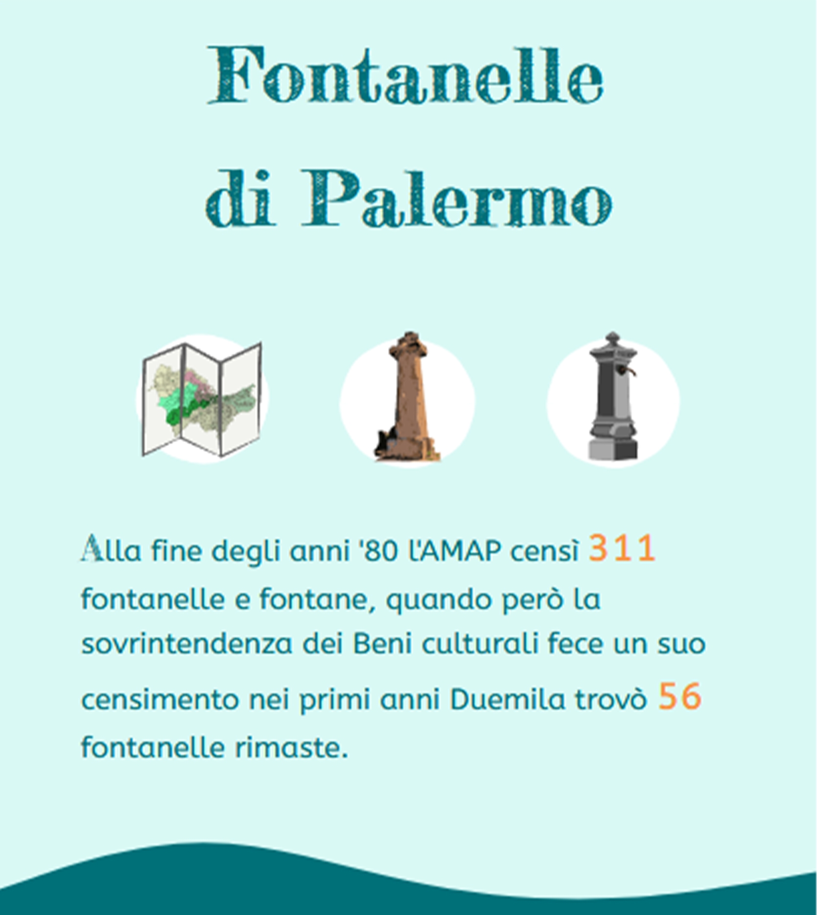
Visualization can be divided into two main sections: the first, on the left side of the page, aims to provide background about fountains in the city, historical references and information about the dataset. The second part, on the right side, shows the dataset and it allows to analyse the data contained. The visualization portion can be divided into two sub-sections, the one on the left where the attention is focused on the city of Palermo and the second one mainly used to compare the context of Palermo with other cities of the world. Due to the geospatial data, emphasis has been laid on geovisualization, where the position and distribution of water points can be identified.
Further charts allow to highlight the proportion between fountains and drinking fountains in different districts of the city.
Interactivity plays a key role because it allows the reuse of available space and the possibility to provide further details on particular situations (fountains or drinking fountains, neighbourhoods, density per population or surface area).
Key features: interactivity, from general to particular.


