Technology
D3.js, Mapbox, OpenStreetMap, Deck.gl, HighCharts, Leaflet, ReactJS, Ant Design
Data source
Categories
Dashboard, interactive visualization, geovisualization, webapp
Website
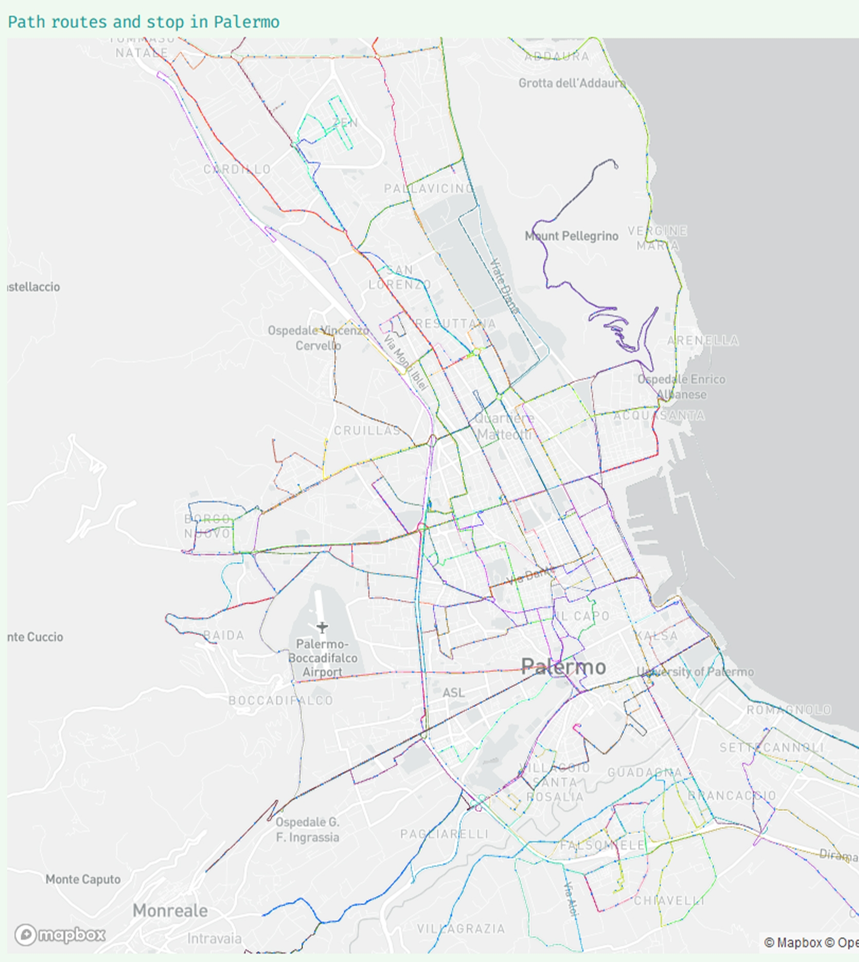
"Palermo bus mobility" describes the distribution of public mobility in the city of Palermo through bus, tram and railways. In consideration of the spatial nature of the dataset, we decided to rely on the use of geovisualization, supporting them with graphics that would allow to highlight some information of interest.
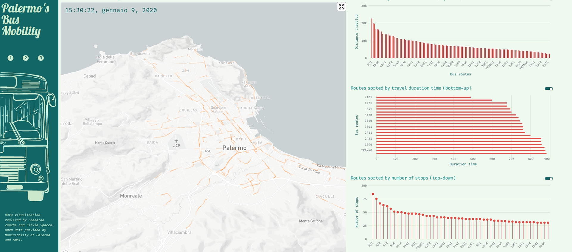
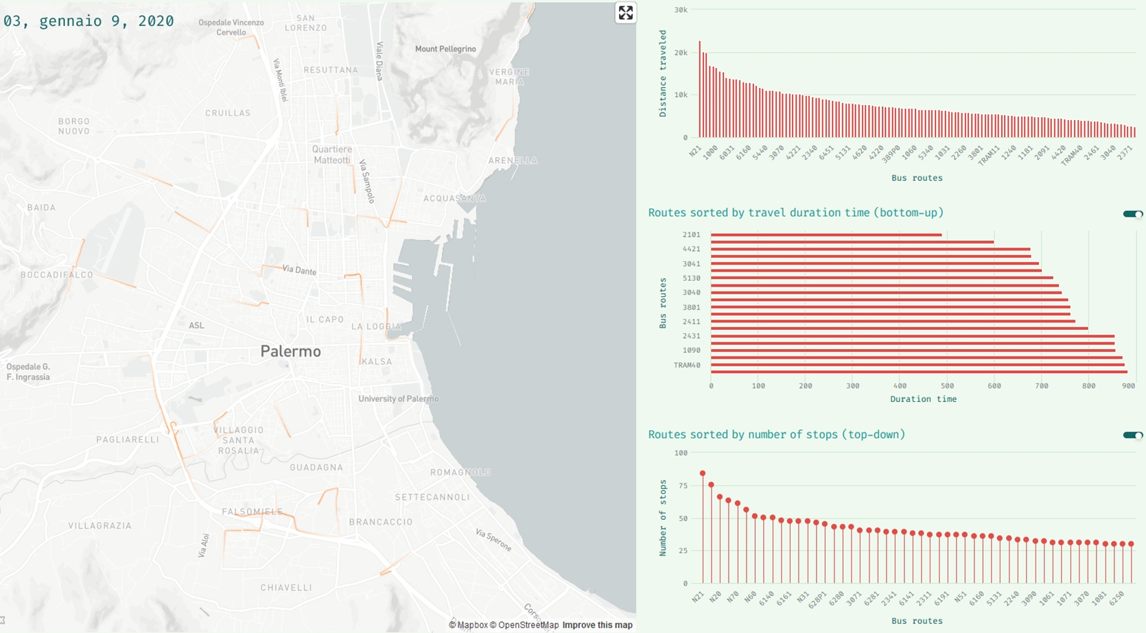
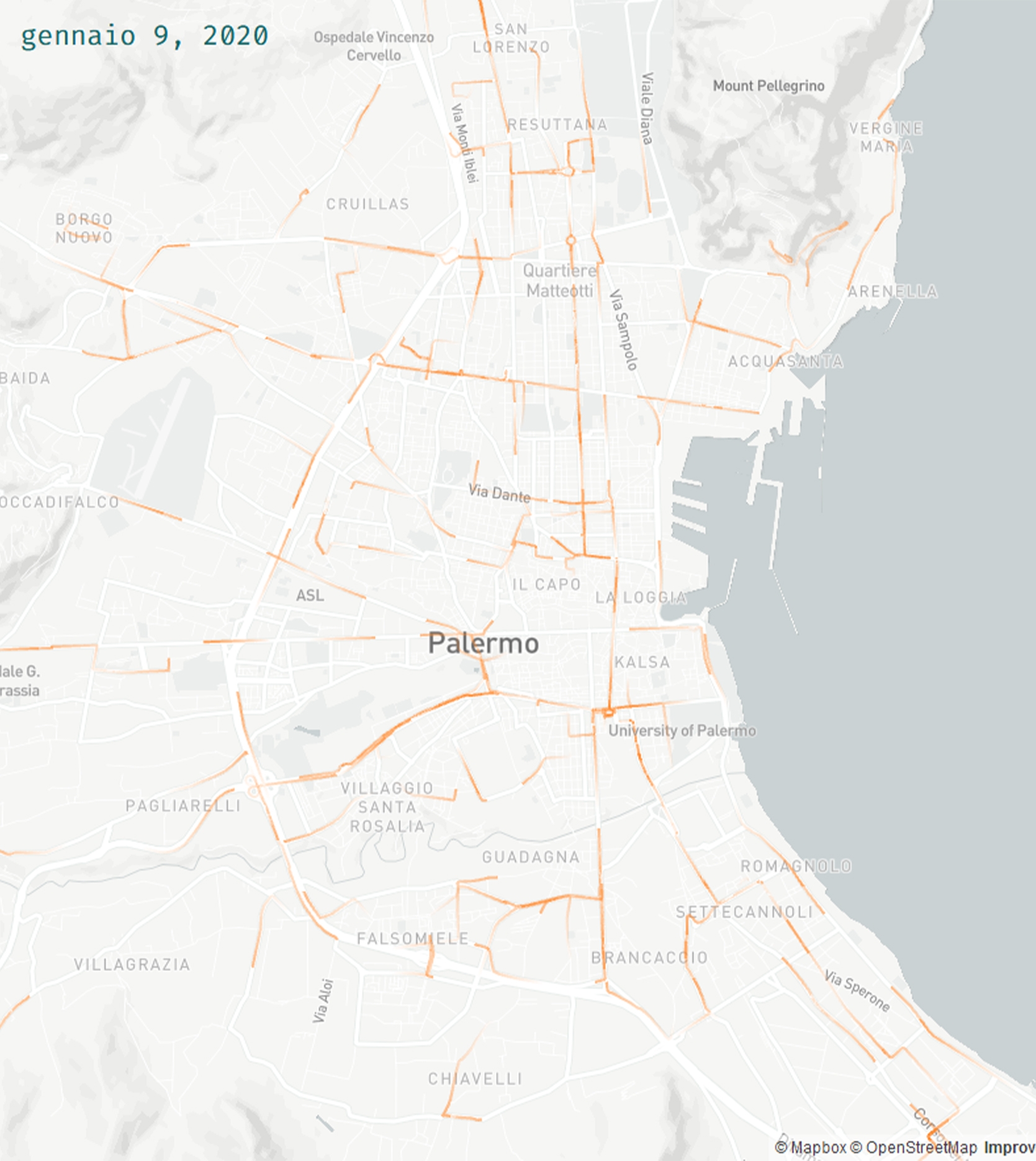
The most effective section is represented by the animated visualization of the bus along their lines: the entire animation shows a typical 24-hour day activity of bus and tram in the city, showing the busiest areas and the most intense hours of traffic.
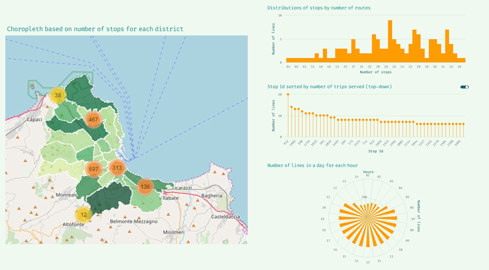
To help users to further read information we decided to insert other maps that could give the ability to study careful phenomenon: distribution of stops, number of lines of each stop, number of stops in each neighborhood, lines and stops throughout the city; useful data to understand which are the areas most served by public service.
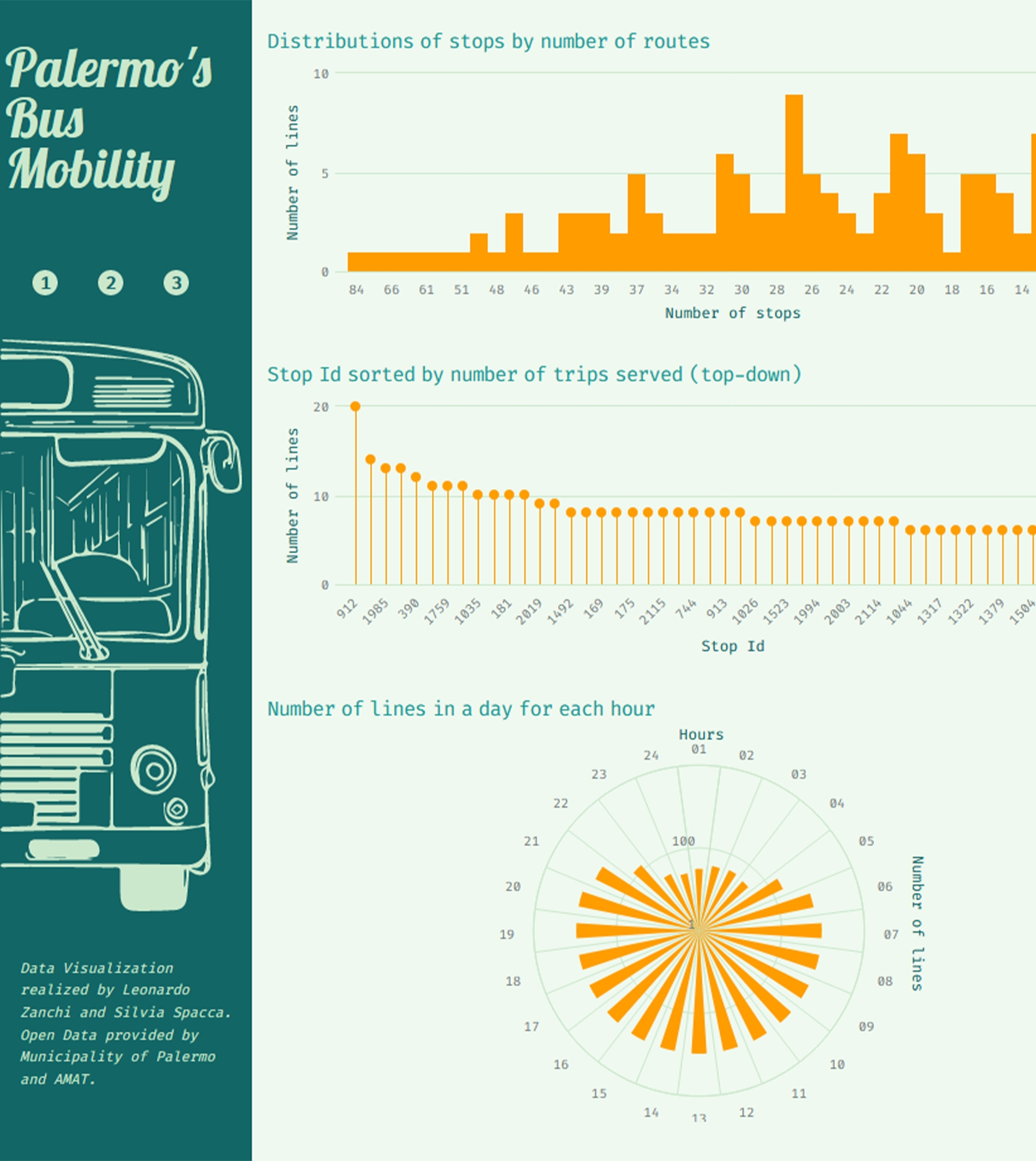
Moreover, we have also included charts that answer to some curiosities as: which is the line that runs the longest distance? Which is the line that takes the most time? Which is the line with the greatest number of stops? Ending with a chart that highlights hours when there is the most bus traffic.
Key features: interactivity, from general to particular.
