Technology
Highcharts, Deck.gl, Mapbox, ReactJS, Ant Design, Illustrator
Data source
Categories
Dashboard, interactive visualization, geovisualization, webapp
2020 was a challenging and dramatic year for many people in many ways. The pandemic, in our opinion, has given an important contribution, probably fundamental, to data visualization and its popularity outside the technical-scientific sector. Never before has there been such a massive use of graphics and visualizations, present in equal measure on large newspapers and small local media and not with the aim of filling editorial gaps but as protagonists of the narration of the current pandemic crisis.
For a long time we wondered whether or not we should also produce something, if there was still a need for visualizations, but especially if we were able to deal with the topic without having deep medical and virological knowledge that would prevent us to fall into easy mistakes.
The mobility datasets marked the turning point for us: we had the opportunity to realize visualizations on Covid-19, without talking directly about the virus and its spread, on which we did not have the necessary background, giving our contribution in such a complex situation.
We decided to represent "The Mobility in the time of Covid-19". Two datasets help us to realize the project, from two different sources: Google and Apple. The first focuses on States and Regions, the second on States and Cities, each with its own categories.
The purpose is to provide a clear representation of the insights contained within the data, highlighting how the responses put in place to stop the spread of the virus had changed mobility in different countries around the world. In order to be as transparent as possible and faithful to the data, we have decided to respect the division between the two datasets, avoiding an easy mix between the two.
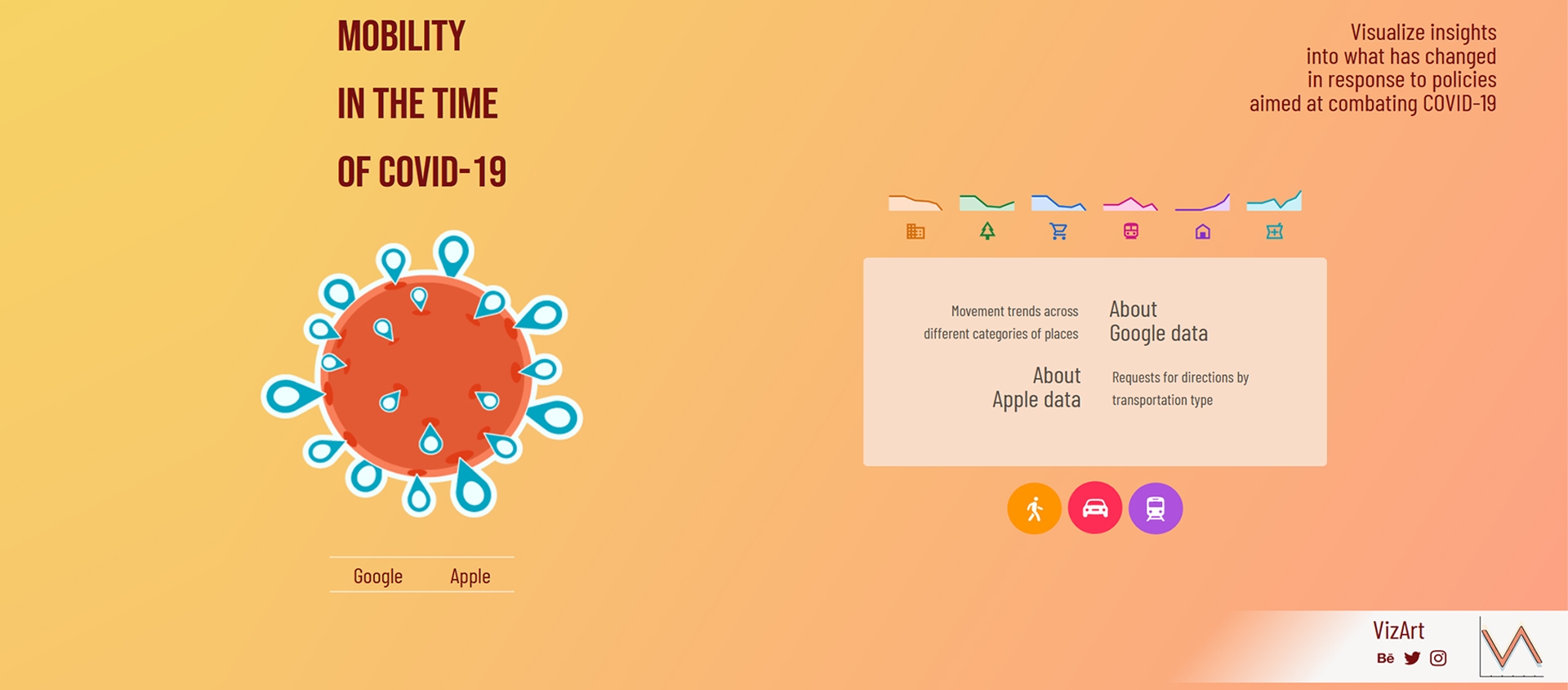
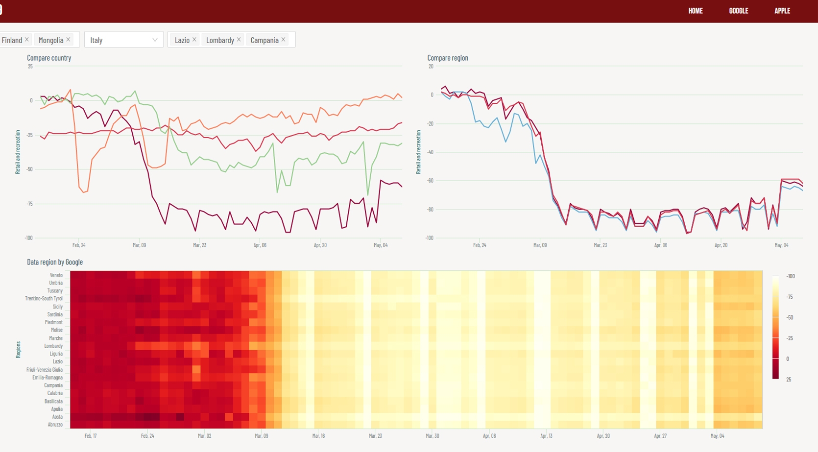
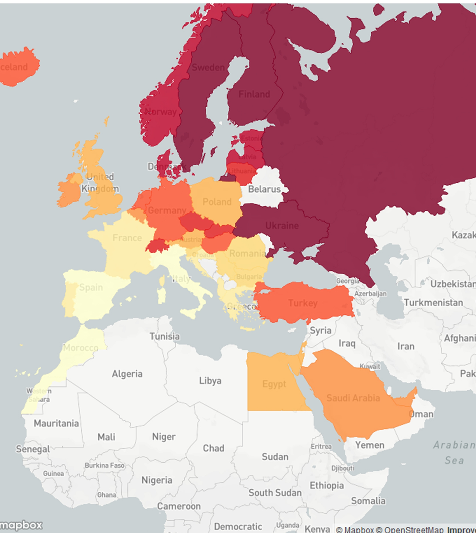
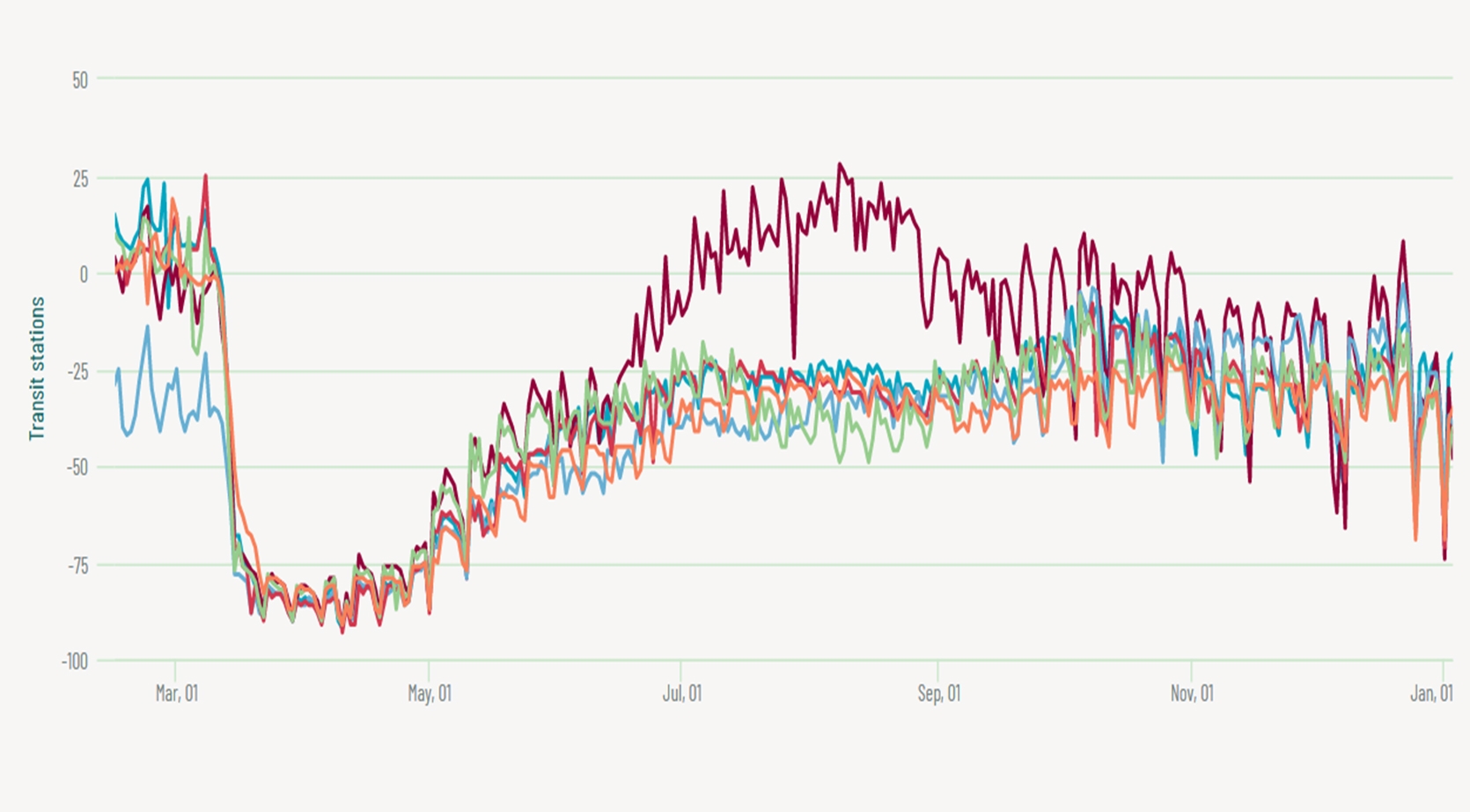
An initial land page welcomes users and provides preliminary information about what they are about to see. Two links provide access to the dashboards and the header allows to move quickly from one page to another. For Apple, our focus was on geovisualization of the data and its temporal evolution, while for Google a heatmap was used to illustrate the changes over time in the region selected. In both cases we included charts that would allow to compare Regions, States and Cities. Moreover, we integrated general information that could give a clear and general overview of the situation that the data showed. Interactivity plays a crucial role, allowing to modify categories, State, Region and City.
Key features: compact, space reuse, interactivity, from general to particular.


