Technology
Highcharts, InDesign, Illustrator
Data source
Categories
Infographic, static, printable
Website
During the pandemic, we were facing with the desire to talk about the virus diffusion, likewise we would avoid medical topics that go beyond our knowledge. For this reason we adopted transverse ways to talk about Covid-19, as the usage of Milan’s open WiFi during the lockdown.
To realize this project has been used the dataset provided by Open Data portal of the Municipality of Milan, already used by us for the visualization "Milan Open WiFi". However, it was necessary to make several modification to the dataset, since the manager has changed the data structure in a few months.
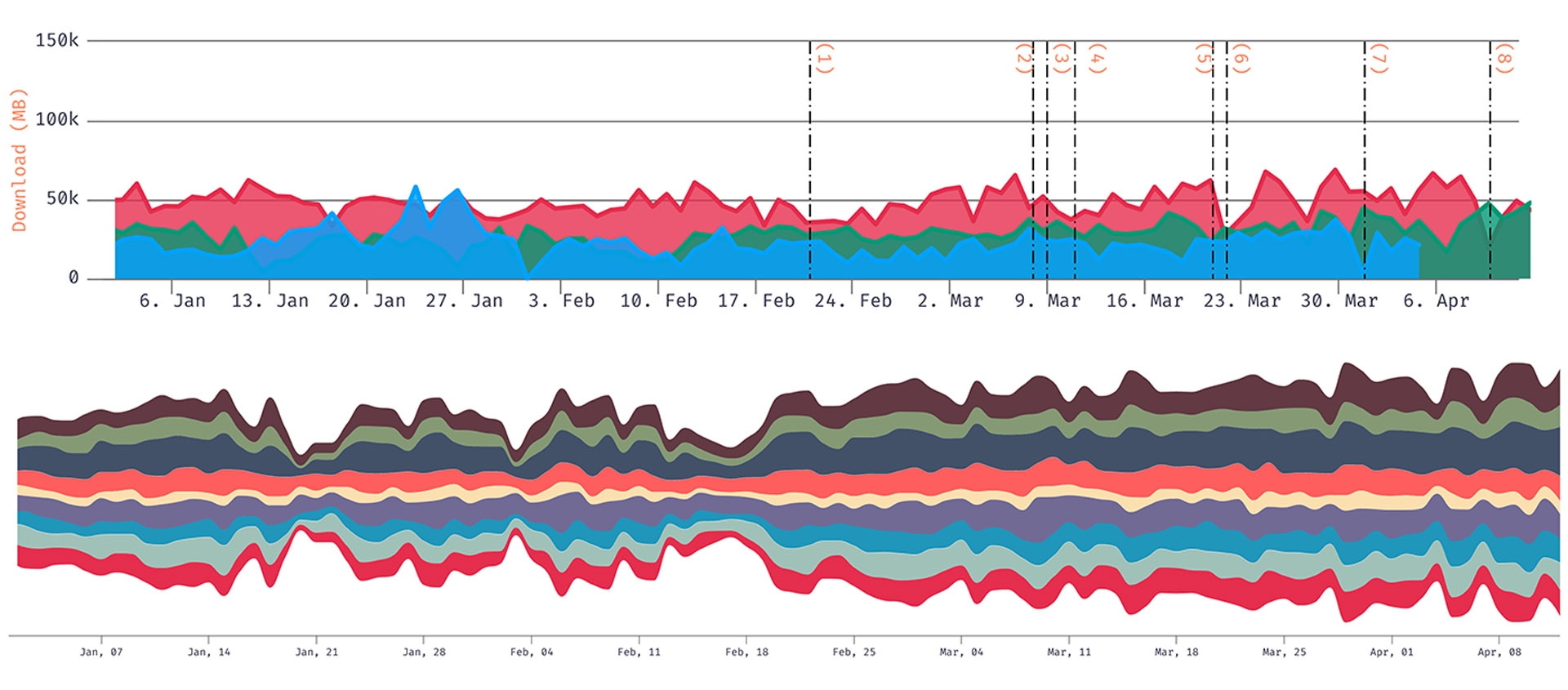
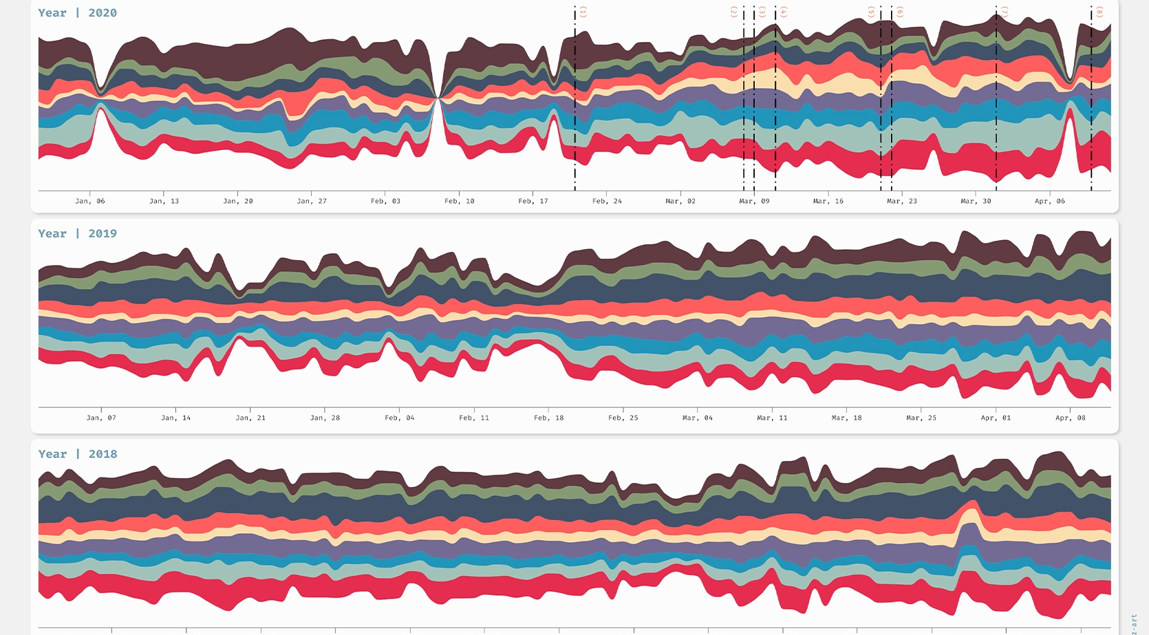
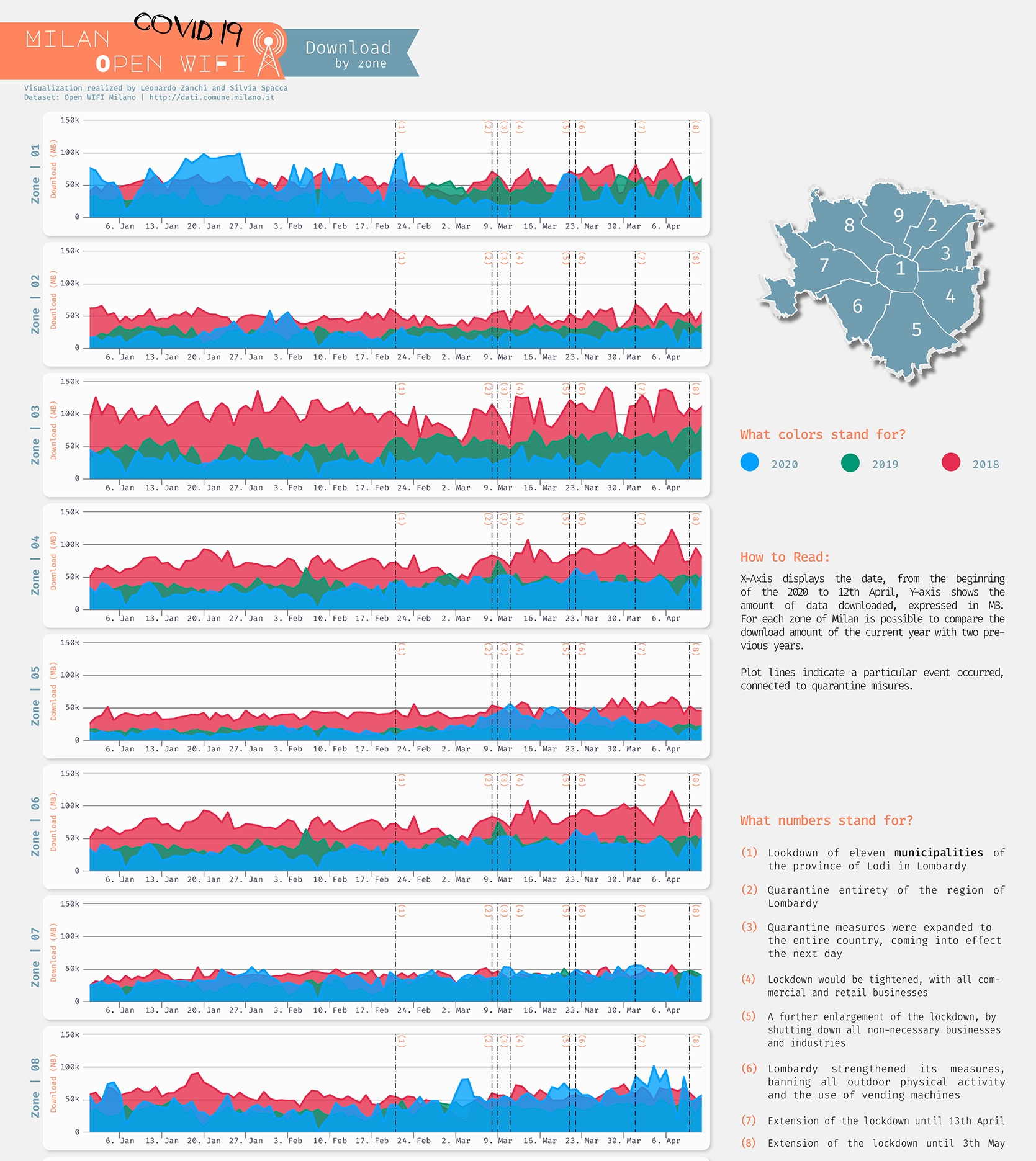
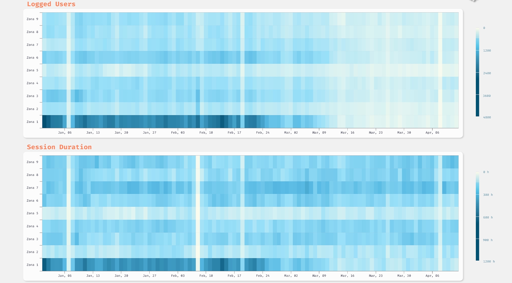
To understand the percentage of variation compared to a non-pandemic period, we used two different dataset: the number of active users, the amount of traffic generated by them and the duration of usage sessions. To represent them, we thought that the most appropriate charts were a Streamgraph and an Area chart for the download traffic and an Heatmap to visualize the number of users and the session duration.
To highlight the differences and simplify the understanding of the data, a temporal analysis was performed by comparing the same interval of months (from January to April) over the last three years and a spatial analysis, through the zoning of the Municipality of Milan.
Key features: static, printable.


