Technology
D3.js, Highcharts, Nivo, Leaflet, Ant Design, ReactJS, OpenStreetMap
Data source
Categories
Dashboard, interactive visualization, geovisualization, webapp
Website
This visualization about the usage of WiFi service inside the Municipality of Milan was born from the accidental discovery of this dataset when we were screening the Open Data available in Italy.
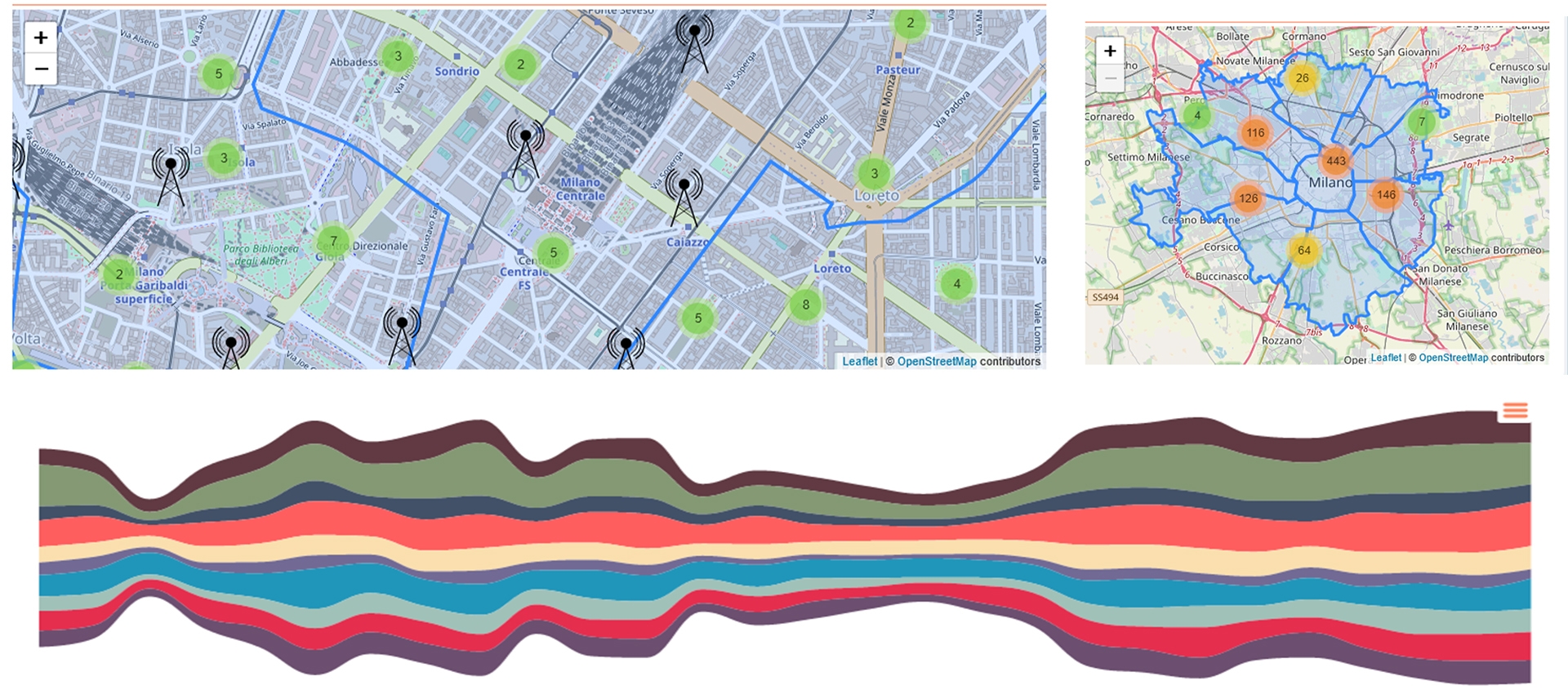
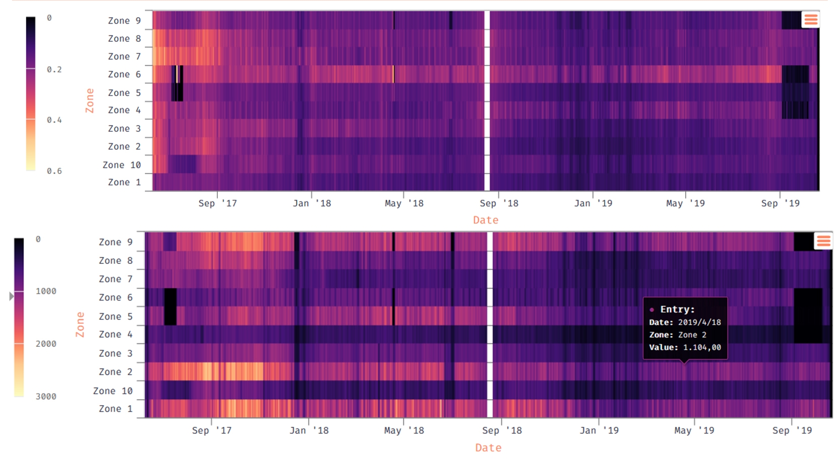
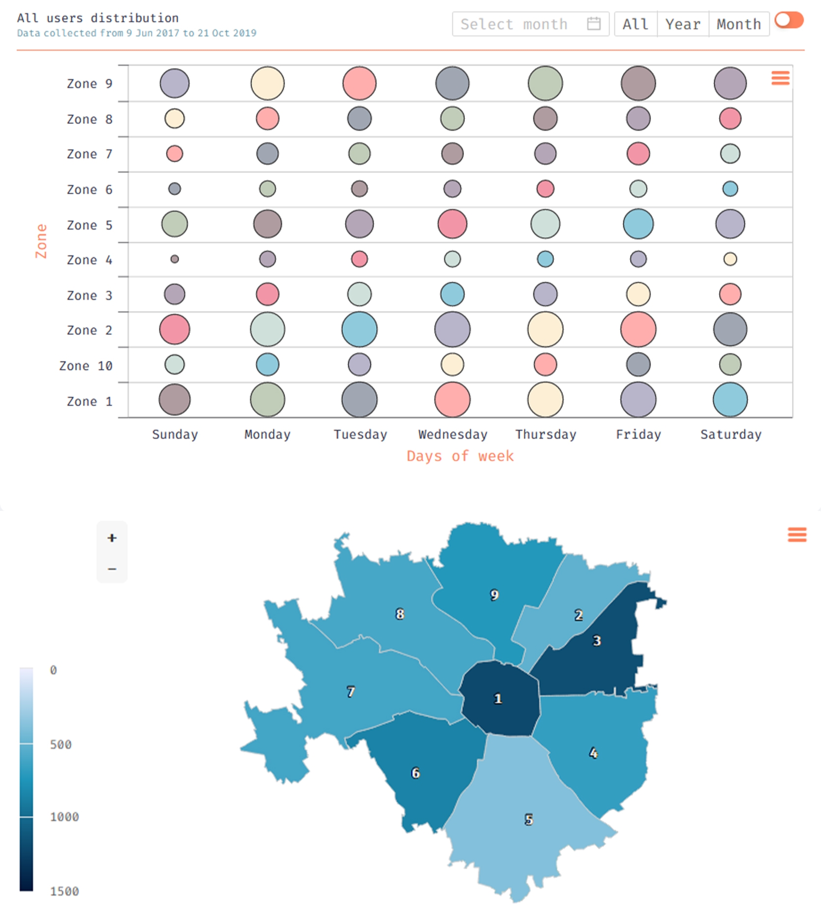
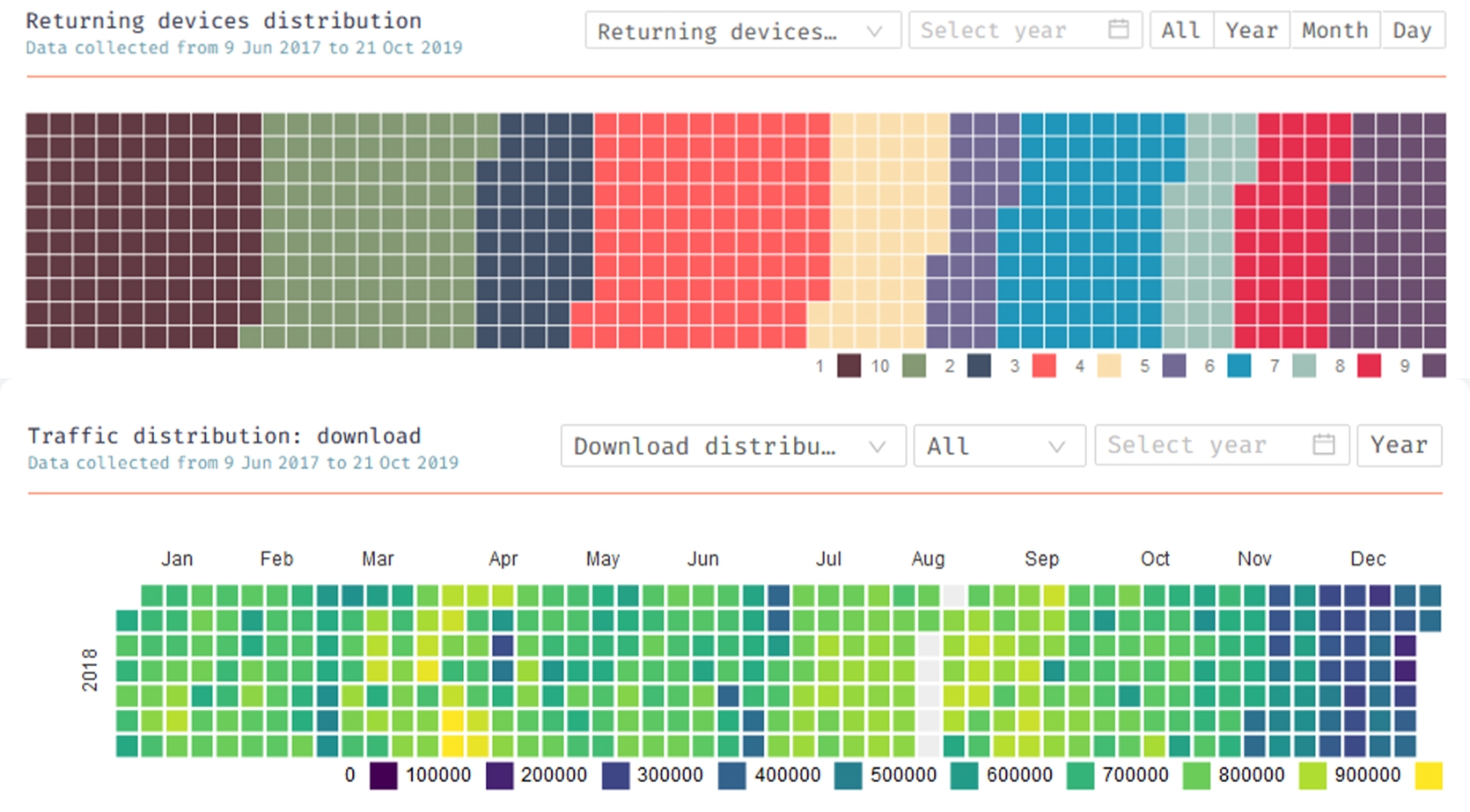
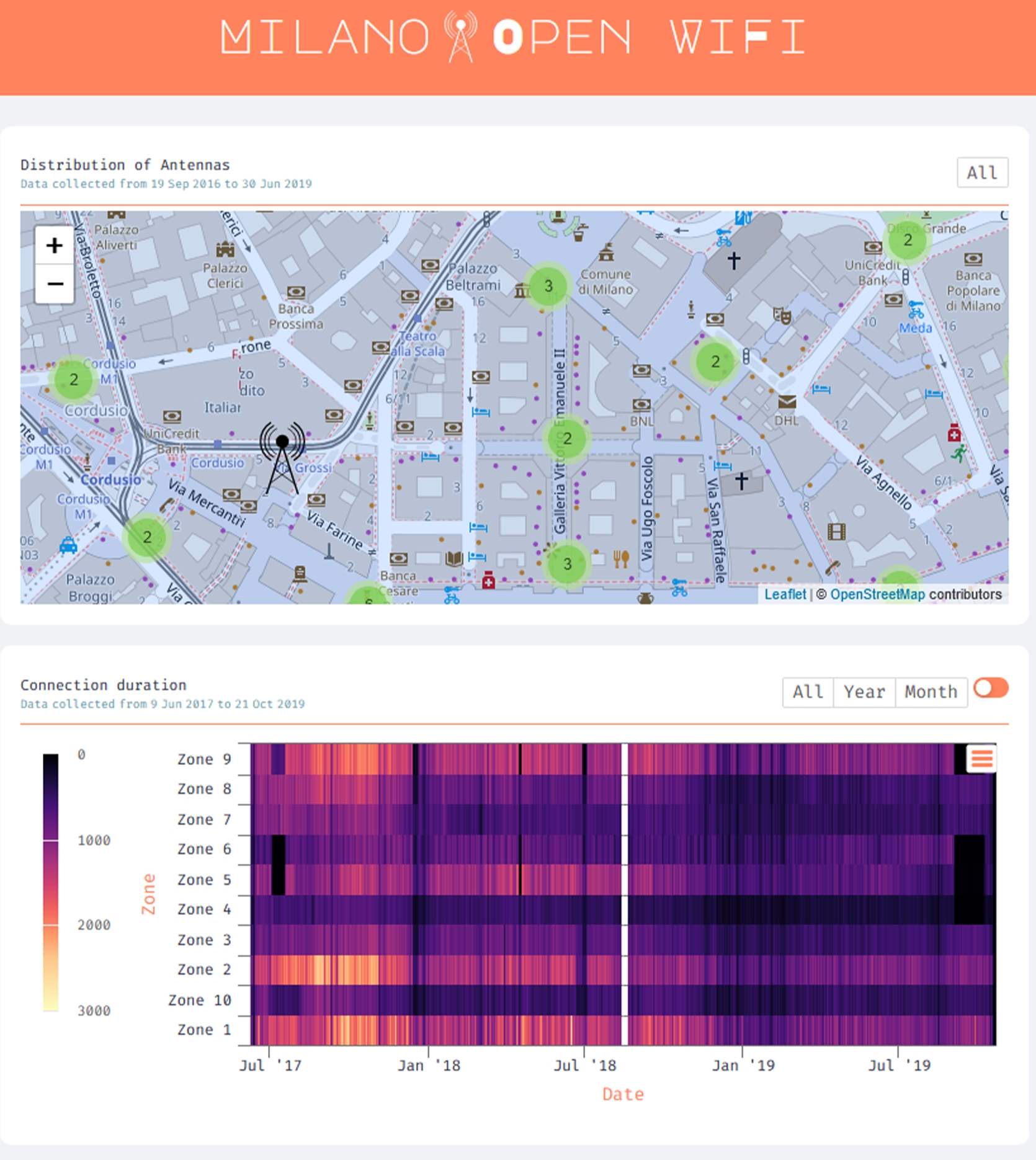
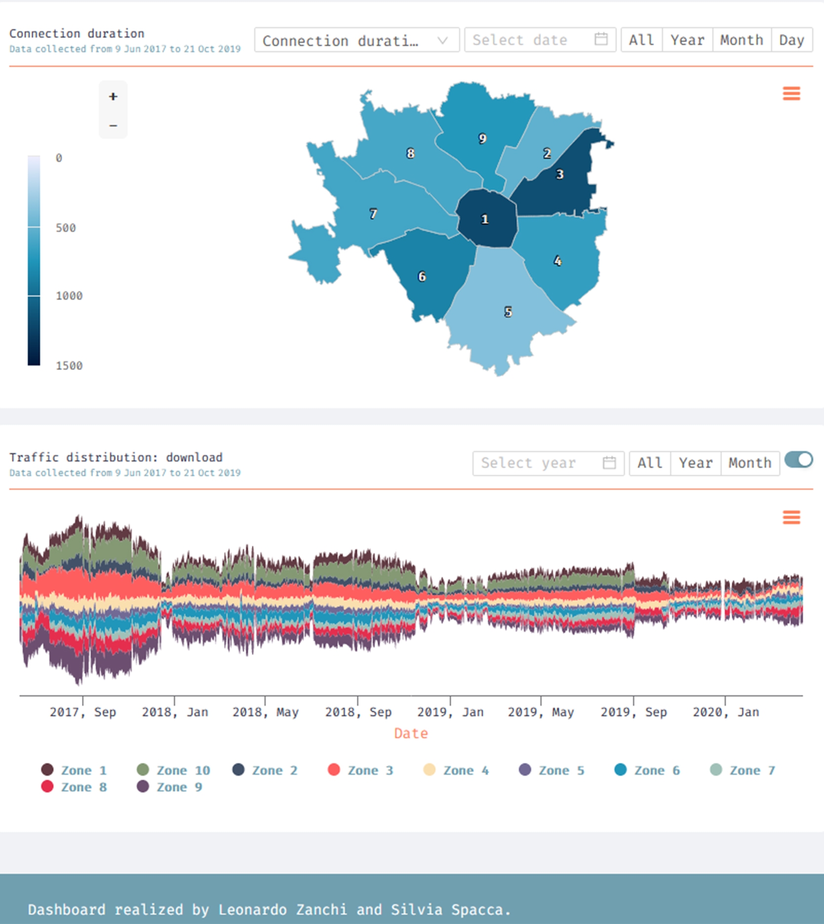
What caught our attention was the temporary coverage of the dataset and the variety of information provided: average of connection time, antennas locations, upload/download traffic, users and devices distribution. Furthermore, data were divided in area of interests, making the analyses more accurate and structured.
We worked on the dataset at the beginning understanding it through a deep analysis, then modifying it to remove inconsistency and to fits it to visualization needs.
This dataviz was realized as a control dashboard, enriching it with a sort of sample cases to show different ways to visualize the same information; every chart with his point of force and weakness. To strengthen the comparison, every chart can change the visualized dataset, the time range (weekly, monthly, annual or custom) and the district.
Key features: space reuse, interactivity.
